Fintech Dashboard
Reducing User Errors in a Fintech Dashboard
↓ 30% user errors
↑ 28% task completion speed
↓ 43% workflow steps
Redesigned a complex finance dashboard to improve clarity and reduce costly user errors.
Role: UX Designer
Duration: 4 Weeks
Tools: Figma (UI Design, Prototyping, Design System)

The Problem
• Difficulty interpreting complex financial data
• High error rates in decision-making
• Overloaded dashboard with poor hierarchy
• Slower task completion in time-sensitive workflows
The Goal
Simplify data visualization and improve clarity for faster, more accurate decision-making.
Key Decisions
The Solution
Redesigned the dashboard with clearer hierarchy, improved data grouping, and simplified layouts to reduce cognitive load and improve scanability.
Before → After
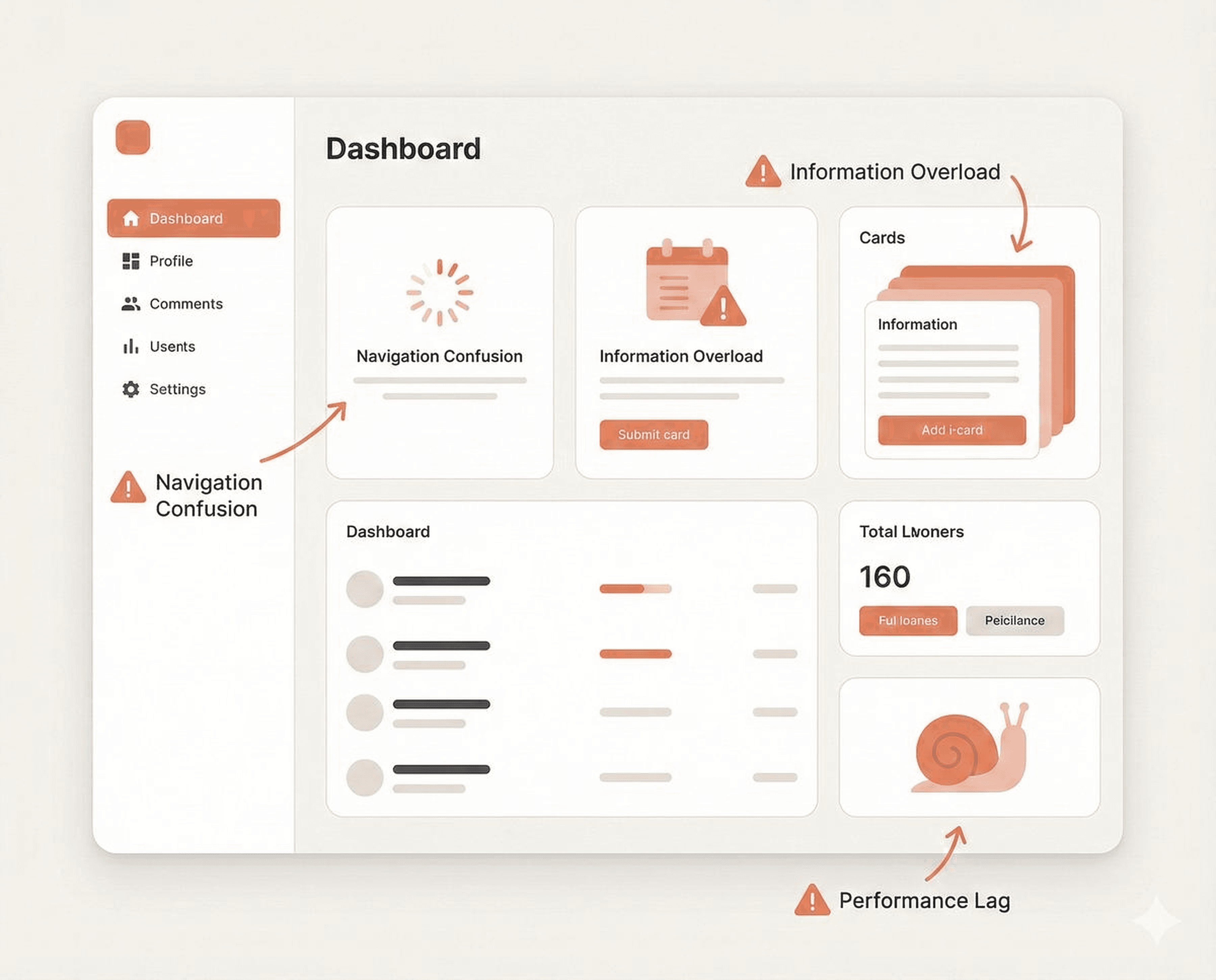
Before
Cluttered layout, difficult to scan
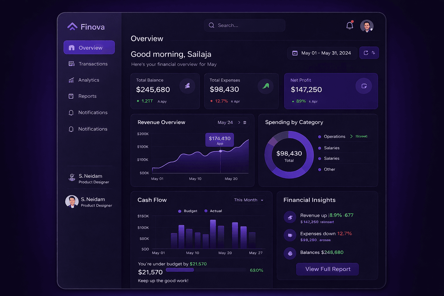
After
Structured layout with clear visual hierarchy
Simplified layout, improved data hierarchy, and reduced cognitive load.
Workflow Improvements
Reduced steps by 43%, improving task efficiency.
The Impact
Reduced errors and streamlined complex workflows, enabling faster and more confident decision-making in data-heavy financial tasks.
Next case study → Digital Signature UX